/* ============================================================ P26: 1920px SITE-WIDE LAYOUT OVERHAUL - Article body: 1280-1400px responsive - Category archive: 3 columns + right sidebar (580px main + 320px sidebar) - Container max-width: 1800px (allow full 1920 use) - Header: distribute nav across full width - Mobile: revert to current behavior ============================================================ */ /* === 1. WIDE-SCREEN CONTAINER MAX-WIDTHS (>=1500px) === */ @media (min-width: 1500px) { /* Elementor default content width */ .elementor-section.elementor-section-boxed > .elementor-container, .elementor-section .elementor-container { max-width: 1800px !important; } /* Astra default container */ .ast-container, .site-content > .ast-container, .site-header > .ast-container, .site-footer > .ast-container { max-width: 1800px !important; } /* Body/site wrapper - allow full viewport */ body.single-post .site-content, body.archive .site-content, body.category .site-content, .elementor-location-archive .elementor-section.elementor-section-boxed > .elementor-container { max-width: 100% !important; } } /* === 2. SINGLE POST ARTICLE BODY - 1280-1400px responsive === */ @media (min-width: 1200px) and (max-width: 1499px) { html body.single-post.single .entry-content, html body.single-post.single .ast-article-single .entry-content, body.wp-singular.single.single-post .entry-content, html body.single-post.single .post-thumb-img-content, body.wp-singular.single.single-post .post-thumb-img-content { max-width: 1100px !important; } } @media (min-width: 1500px) and (max-width: 1799px) { html body.single-post.single .entry-content, html body.single-post.single .ast-article-single .entry-content, body.wp-singular.single.single-post .entry-content, html body.single-post.single .post-thumb-img-content, body.wp-singular.single.single-post .post-thumb-img-content { max-width: 1340px !important; } } @media (min-width: 1800px) { html body.single-post.single .entry-content, html body.single-post.single .ast-article-single .entry-content, body.wp-singular.single.single-post .entry-content, html body.single-post.single .post-thumb-img-content, body.wp-singular.single.single-post .post-thumb-img-content { max-width: 1400px !important; } } /* === 3. CATEGORY ARCHIVE - 3 COL + RIGHT SIDEBAR (>=1500px) === */ @media (min-width: 1500px) { /* Make the posts widget column narrower to leave room for sidebar */ .elementor-element-w_posts { flex: 0 0 calc(100% - 360px) !important; max-width: calc(100% - 360px) !important; width: calc(100% - 360px) !important; } /* Injected sidebar styling */ .cn-studio-archive-sidebar { position: relative; width: 340px !important; flex: 0 0 340px !important; margin-left: 20px; padding: 0; } .cn-studio-archive-sidebar > div { background: rgba(255, 255, 255, 0.03) !important; border: 1px solid rgba(255, 255, 255, 0.08) !important; border-radius: 16px !important; padding: 24px 22px !important; margin-bottom: 20px !important; backdrop-filter: blur(10px); -webkit-backdrop-filter: blur(10px); } .cn-studio-archive-sidebar h4 { color: #fff !important; font-size: 14px !important; font-weight: 600 !important; letter-spacing: 0.08em; text-transform: uppercase; margin: 0 0 16px !important; padding: 0 0 12px !important; border-bottom: 1px solid rgba(255, 255, 255, 0.08) !important; } .cn-studio-archive-sidebar ul { list-style: none !important; padding: 0 !important; margin: 0 !important; } .cn-studio-archive-sidebar li { padding: 10px 0 !important; border-bottom: 1px solid rgba(255, 255, 255, 0.04) !important; } .cn-studio-archive-sidebar li:last-child { border-bottom: 0 !important; } .cn-studio-archive-sidebar a { color: rgba(255, 255, 255, 0.78) !important; text-decoration: none !important; font-size: 14px !important; line-height: 1.5 !important; display: block; transition: color 0.2s; } .cn-studio-archive-sidebar a:hover { color: #a29bfe !important; } .cn-studio-archive-sidebar .cat-mini { display: inline-block; padding: 4px 10px; margin: 4px 4px 4px 0; background: rgba(108, 92, 231, 0.15); border: 1px solid rgba(108, 92, 231, 0.3); border-radius: 999px; color: #c4baff !important; font-size: 12px !important; } .cn-studio-archive-sidebar .newsletter-box { background: linear-gradient(135deg, rgba(108,92,231,0.18) 0%, rgba(0,212,255,0.12) 100%) !important; border: 1px solid rgba(108, 92, 231, 0.3) !important; } .cn-studio-archive-sidebar .newsletter-box p { color: rgba(255, 255, 255, 0.78) !important; font-size: 13px !important; line-height: 1.55 !important; margin: 0 0 14px !important; } .cn-studio-archive-sidebar .newsletter-box input { width: 100% !important; background: rgba(10, 13, 58, 0.6) !important; border: 1px solid rgba(255, 255, 255, 0.12) !important; color: #fff !important; padding: 10px 12px !important; border-radius: 8px !important; font-size: 13px !important; margin-bottom: 8px !important; box-sizing: border-box !important; } .cn-studio-archive-sidebar .newsletter-box button { width: 100% !important; background: linear-gradient(135deg, #6c5ce7 0%, #00d4ff 100%) !important; color: #fff !important; border: 0 !important; padding: 10px 14px !important; border-radius: 8px !important; font-size: 13px !important; font-weight: 600 !important; cursor: pointer !important; } } /* === 4. HEADER LAYOUT for 1920px (full width padding, distribute nav) === */ @media (min-width: 1500px) { header.site-header#masthead .ast-container, header.ast-main-header-wrap .ast-container, .site-header > .ast-container { max-width: 1800px !important; padding-left: 60px !important; padding-right: 60px !important; } /* Center the nav evenly */ .site-branding { flex: 0 0 auto !important; } .main-header-bar-navigation, .ast-header-woo-cart, .ast-masthead-custom-menu-items { flex: 1 1 auto !important; } /* Better visual balance for nav items */ .main-header-menu > .menu-item > a { padding: 0 18px !important; } } /* === 5. WIDE-SCREEN TYPOGRAPHY TWEAKS (1920px) === */ @media (min-width: 1500px) { /* Article body paragraphs: keep readable line-length */ html body.single-post.single .entry-content p, body.wp-singular.single.single-post .entry-content p { font-size: 18px !important; line-height: 1.85 !important; } /* Article body H2 spacing */ html body.single-post.single .entry-content h2, body.wp-singular.single.single-post .entry-content h2 { font-size: 32px !important; margin-top: 56px !important; margin-bottom: 24px !important; } /* Article body H3 spacing */ html body.single-post.single .entry-content h3, body.wp-singular.single.single-post .entry-content h3 { font-size: 24px !important; margin-top: 40px !important; margin-bottom: 18px !important; } } /* === 6. CATEGORY ARCHIVE LAYOUT (sidebar injection point) === */ @media (min-width: 1500px) { /* Make the inner section column 2-col flex */ body.category .elementor-section .elementor-column[data-col="100"], body.archive .elementor-section .elementor-column[data-col="100"] { display: flex !important; flex-wrap: wrap !important; align-items: flex-start !important; } body.category .elementor-section .elementor-column[data-col="100"] > .elementor-widget-wrap, body.archive .elementor-section .elementor-column[data-col="100"] > .elementor-widget-wrap { width: calc(100% - 360px) !important; flex: 0 0 calc(100% - 360px) !important; padding: 0 20px 0 0 !important; } } /* === 7. MOBILE REVERT (don't break what we have) === */ @media (max-width: 1499px) { .cn-studio-archive-sidebar { display: none !important; } } /* === 8. SIDEBAR INJECTION (>=1500px on category/tag archives) === */ (function() { function injectSidebar() { if (window.innerWidth < 1500) return; if (!document.body.classList.contains('category') && !document.body.classList.contains('tag') && !document.body.classList.contains('tax-ld_course_category')) return; if (document.querySelector('.cn-studio-archive-sidebar')) return; // Find the section column containing the posts widget var postsWidget = document.querySelector('.elementor-element-w_posts'); if (!postsWidget) return; var column = postsWidget.closest('.elementor-column'); if (!column) return; var columnWrap = column.querySelector('.elementor-widget-wrap') || column.querySelector('.elementor-column-wrap'); if (!columnWrap) return; // Build sidebar var sidebar = document.createElement('aside'); sidebar.className = 'cn-studio-archive-sidebar'; sidebar.innerHTML = [ '
', '

📑 选品分类

', '
', '选品研究', '独立站', '亚马逊', '全部', '
', '
', '
', '

📬 每周三早 8 点

', '

跨境选品研究 · 数据驱动的出海判断

', '', '', '
', '
', '

🔥 最新研究

', '', '
', ].join(''); columnWrap.parentNode.insertBefore(sidebar, columnWrap.nextSibling); } if (document.readyState === 'loading') { document.addEventListener('DOMContentLoaded', injectSidebar); } else { injectSidebar(); } try { var obs = new MutationObserver(function() { injectSidebar(); }); document.addEventListener('DOMContentLoaded', function() { obs.observe(document.body, { childList: true, subtree: true }); }); } catch (e) {} })();

Microsoft Clarity 5 种热力图完全指南:Click/Scroll/Area/Conversion/Attention

Microsoft Clarity 5 种热力图完全指南:Click/Scroll/Area/Conversion/Attention

热力图是「看一眼就知道用户在干嘛」的最快工具。本文用 5 分钟讲清楚 Microsoft Clarity 的 5 种热力图分别看什么、怎么读、怎么用,搭配 39 张官方截图 + 一张对比表 + 6 条实战建议,看完就能上手。

TL;DR · 三分钟读完
  • Click maps:看用户「点了哪里」——找死按钮
  • Scroll maps:看用户「滚到哪」——找被折叠的关键内容
  • Area maps:看业务区(CTA、表单)点击率——自定义矩形
  • Conversion maps:看「在 X 区点过的人 % 多少转化」——找真有效的 CTA
  • Attention maps:AI 综合点击+滚动+鼠标移动,给老板看 5 秒讲故事

为什么要用热力图

独立站运营最常踩的坑是「我觉得这个按钮很重要,但用户根本不点」。GA4 能告诉你转化率,热力图能告诉你为什么转化率是这个数。一个看数字,一个看行为——两件事永远互补。

热力图不是「好不好看」的问题,是「用户到底想不想点」的问题。
— 阿甘聊跨境

Microsoft Clarity 是免费、无采样、热力图 + 录屏 + 漏斗三件套都给的工具,最适合独立站起步阶段。整篇文章基于 Clarity 官方文档(learn.microsoft.com/en-us/clarity/heatmaps/)写成。

5 种热力图对比

5 种图不是替代关系,是层层递进的。先用 click + scroll 摸清「用户行为」,再用 area + conversion 做「业务分析」,最后用 attention 给决策层汇报。

类型 看什么 核心问题 用在哪
Click maps 用户点击位置 用户想点哪里? 找死按钮、误点
Scroll maps 用户滚动深度 用户看到了哪里? 找被折叠的内容
Area maps 业务区点击率 这个 CTA 有多热门? 自定义矩形分析
Conversion maps 区域内点击+转化 哪个 CTA 真正带来转化? 漏斗优化
Attention maps AI 综合热区 用户注意力在哪? 整体布局审视

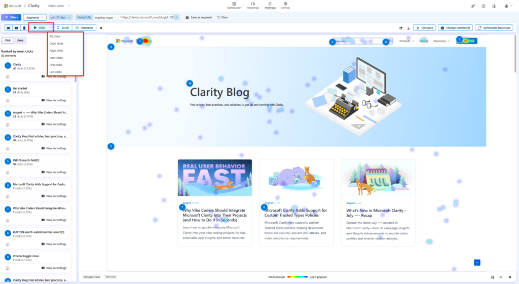
点击热力图 · 看用户「想点哪里」

告诉你用户在页面上「点了哪里」。每个点击都是一个红点,红点越密集的位置 = 用户越想点的位置。

click maps.

click maps.
💡 使用场景

找到被忽略的 CTA、被误点的元素(用户以为可点但实际不是链接的)

怎么读这张图

01
红点越密集 = 该位置被点击次数越多
02
看”应该被点但没被点”的元素(CTA 按钮、首图、价格)
03
看”被点了但不该被点”的元素(误点 = 用户期待的功能缺失)

「点 0 次的 CTA = 隐形 CTA」——把 click map 当作”按钮测温计”用。

最适用:着陆页优化、按钮位置测试

click maps left panel.

click-maps 数据面板:每个区域的点击率/转化率展示

滚动热力图 · 看用户「看到了哪里」

告诉你用户「滚到了哪里」。蓝色 = 看到的人,灰色 = 没看到的人。一眼能看出页面哪一段被折叠了。

Scroll maps.

Scroll maps.
💡 使用场景

判断首屏以下内容是否被看到,决定关键信息该放哪

怎么读这张图

01
蓝色区域 = 100% 用户看到
02
颜色越浅 = 看到的人越少
03
底部”average fold”线 = 50% 用户滚到的位置

「50% 用户没滚到第二屏」——这意味着第二屏以下的内容几乎不存在。

最适用:长文着陆页、博客文章、产品详情页

Scroll maps left panel.

scroll-maps 数据面板:每个区域的点击率/转化率展示

区域热力图 · 看业务区「点击率」

在页面上画矩形区域,统计这个区域里有多少点击。和 click map 区别是:area 是你自己定义的「业务区」,比如 CTA 按钮、注册表单。

Area maps.

Area maps.
💡 使用场景

评估自己定义的”业务区”(CTA、注册表单、加购按钮)的真实点击率

怎么读这张图

01
先在页面上画矩形区域(支持多个)
02
每个区域显示:点击数、独立点击者数、点击率
03
对比不同区域的点击率,砍掉低于平均的

「高点击 ≠ 高转化」——area map 帮你区分「真热门」和「假热门」。

最适用:漏斗页、A/B 测试结果对比

View area in area maps.

area-maps 数据面板:每个区域的点击率/转化率展示

转化热力图 · 看「点过的人 % 多少转化」

在 area 基础上再加一层「是否转化」过滤。能看到「在 hero 区点了 CTA 的用户里,有多少最终下了单」。

conversion maps.

conversion maps.
💡 使用场景

找出真正带来转化的 CTA,对比”看起来很热门但实际不转化”的按钮

怎么读这张图

01
配置好转化目标(购买、注册、提交表单)
02
每个 area 显示:在该区域点过的人里,多少 % 最终转化
03
关注”高点击 + 低转化”区域 = 误导用户的 CTA

「在 hero 点 CTA 的用户里,% 多少最终下单」——这个数字才决定值不值得改版。

最适用:电商漏斗优化、注册转化分析

Edit Areas button in conversion maps.

conversion-maps 数据面板:每个区域的点击率/转化率展示

注意力热力图 · AI 综合「最关注区」

综合点击 + 滚动 + 鼠标移动 + 滚动深度,AI 算出来的「用户最关注的热区」,是 5 种图里信息密度最高的。

Attention maps.

Attention maps.
💡 使用场景

一眼看出页面哪里吸引最多注意力,给老板/团队汇报用

怎么读这张图

01
颜色越深 = 用户综合注意力越强(点击+滚动+鼠标移动+滚动深度)
02
快速发现「设计好看但没人看」的区域
03
给非技术人员讲故事用,5 秒讲完

「设计好看 ≠ 用户爱看」——attention map 是「真好看」的唯一裁判。

最适用:A/B 测试对照、整体布局审视

View attention maps.

attention-maps 数据面板:每个区域的点击率/转化率展示

过滤维度 + 实战建议

过滤维度

5 种图都支持 4 个维度的过滤,可以叠加:

  • 设备:Desktop / Mobile / Tablet
  • 流量来源:Direct / Search / Social / Email 等
  • 国家:按 ISO 国家代码过滤
  • 时间范围:最近 24h / 7d / 30d / 自定义

实战建议:先按”移动端 + 直达流量”看,再切”桌面 + 搜索”看,往往差异巨大。

6 条实战建议

01
看点击先于看滚动
click map 能告诉你”用户想做什么”,scroll map 只告诉你”他们看到了什么”。先用 click map 找到死按钮,再用 scroll map 找被折叠的关键内容。
02
优先看死按钮
如果某个 CTA 上 0 点击,先确认是不是位置太靠下(看 scroll map),再确认是不是文案有问题(看 recordings),最后改设计。
03
area map 一定要画业务区
不要拿 click map 看整个页面。先把”加购按钮、立即注册、首图”等业务区圈出来,再看 area 的点击率。
04
conversion map 看漏斗
conversion 是「在 X 区点过的人里,% 多少转化了」。对比不同 CTA 区的转化率,砍掉低于平均的。
05
attention map 是综述
一个 dashboard 视图。给老板看的时候用 attention map,5 秒讲完故事。
06
配合录屏看
热力图告诉你”发生了什么”,session recording 告诉你”为什么”。两件事永远一起看。

热力图 + 录屏 = 行为分析的完整闭环

热力图告诉你”发生了什么”,session recording 告诉你”为什么”。Clarity 两者都免费,强烈建议任何热力图分析的结论都去录屏里验证一下。

⚡ 进阶工作流

1. 打开 click map → 找到死 CTA
2. 点击该 CTA → 跳转到对应 session recording
3. 看 5-10 个真实用户在这个 CTA 上的行为(犹豫?滑过?找别的?)
4. 总结原因 → 改设计

总结

Microsoft Clarity 的 5 种热力图不是 5 个独立工具,是5 个层次的递进分析。从「点了哪里」到「哪里带来转化」,从「行为分析」到「业务决策」。配合 session recording 和漏斗分析,Clarity 是独立站运营最值得装的免费工具之一。

装 Clarity 不花一分钱,但能帮你找出”用户为什么不下单”的答案。
— 阿甘聊跨境

参考文档